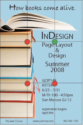
One element to think about first when designing is structure. Start by deciding where you want your focal point to be:

- Look at your page and break it up into sections (3 is a good place to start). If you want more than 3 sections, just remember: keep the number odd! This makes a better design layout.
- Look at where the sections intersect with each other. These places make strong focal points—you can place your main focus here, to create interest.
One thing to note: items placed directly in the center of the page do not create as much interest as items that are off center.
Other elements to consider when designing are balance, white space (this helps with balance, as well as directs the viewer's eye), proximity (the distance between items and how they are placed), alignment (which affects readability of the page), consistency (which helps the reader know where to find things), and the types of images you choose to use.
 A fantastic program to use for creating rich, interactive layouts for both print and online publication is Adobe InDesign. InDesign CS5 is the newest version of this program, and features all sorts of exciting tools perfect for creating a high-quality layout.
For more tips on the elements of design, check out our courses on Design & Layout, Graphic Design Principles, and Typography with InDesign, and make sure to take advantage of the first three FREE training tutorials!


0 comments:
Post a Comment